
Group Project | Mobile App Design | July - August 2020

To research, prototype, test, and validate an idea for a brand-new mobile app. The app must solve a real, clearly identified need in users’ everyday lives.
It is widely known that restaurant goers, struggle with agreeing on what and where to eat when planning outings. This causes frustration when planning social experiences which can leave people feeling hangry.
‘Ballot Bites’ assists users with decisions on what to eat and where to go. Family and friends complete individual ballots, and once results are calculated, the app presents a variety of restaurants for the group to choose from. The app also offers a ‘roll the dice’ option to eliminate decision making.
The ‘Ballot Bites’ app will effectively remove the frustration of what and where to eat."
Mayur Diar & Natasha Nanda
User Research, Ideation & Brainstorming, Wireframing, Prototyping, Interaction Design, Visual Design
Adobe XD, Illustrator, Photoshop; Miro; Figma; G-Suite; InVision; Trello
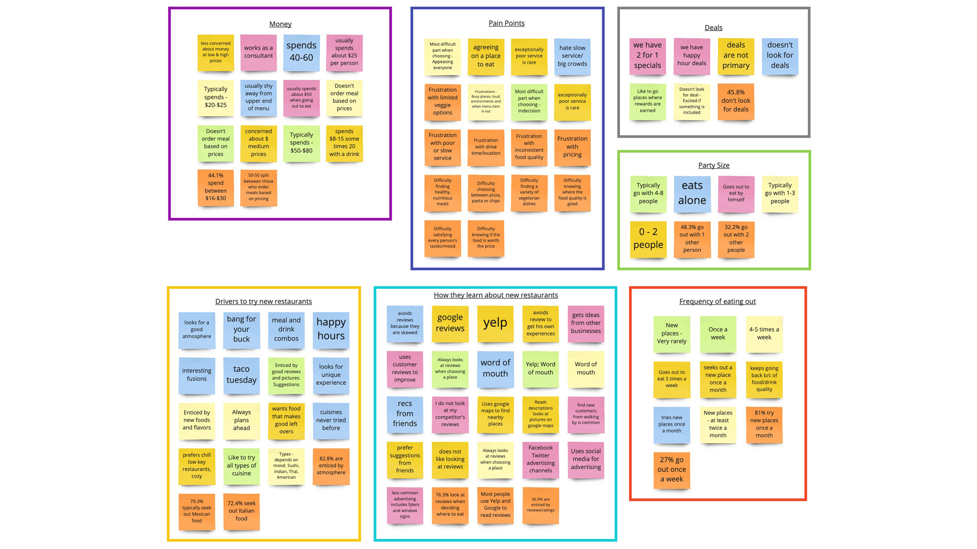
Our methodology began with 5 one on one interviews with different participants that met general requirements listed below for our study. Our team used a semi-structured method for questioning. We used a combination of probing and open-ended questions to gain qualitative information. We also distributed a survey to collect general qualitative data. The survey was created through a google poll and posted on Facebook, Instagram and LinkedIn.
Our ideal participant is a frequent mobile application user that is comfortable with technology. They have enough leisure time to eat out at least once a week. These participants allow us a greater understanding of the main struggles that the frequent diner is affected by.
We developed our interview/survey questions by using our proto-persona and user research plan as a guideline. We first brainstormed problems associated with going out to eat. We then developed research questions that are structured to help our team identify common consumer pain points and possible areas of improvement.
We learned that the two main concerns our target audience has with going out to eat are:
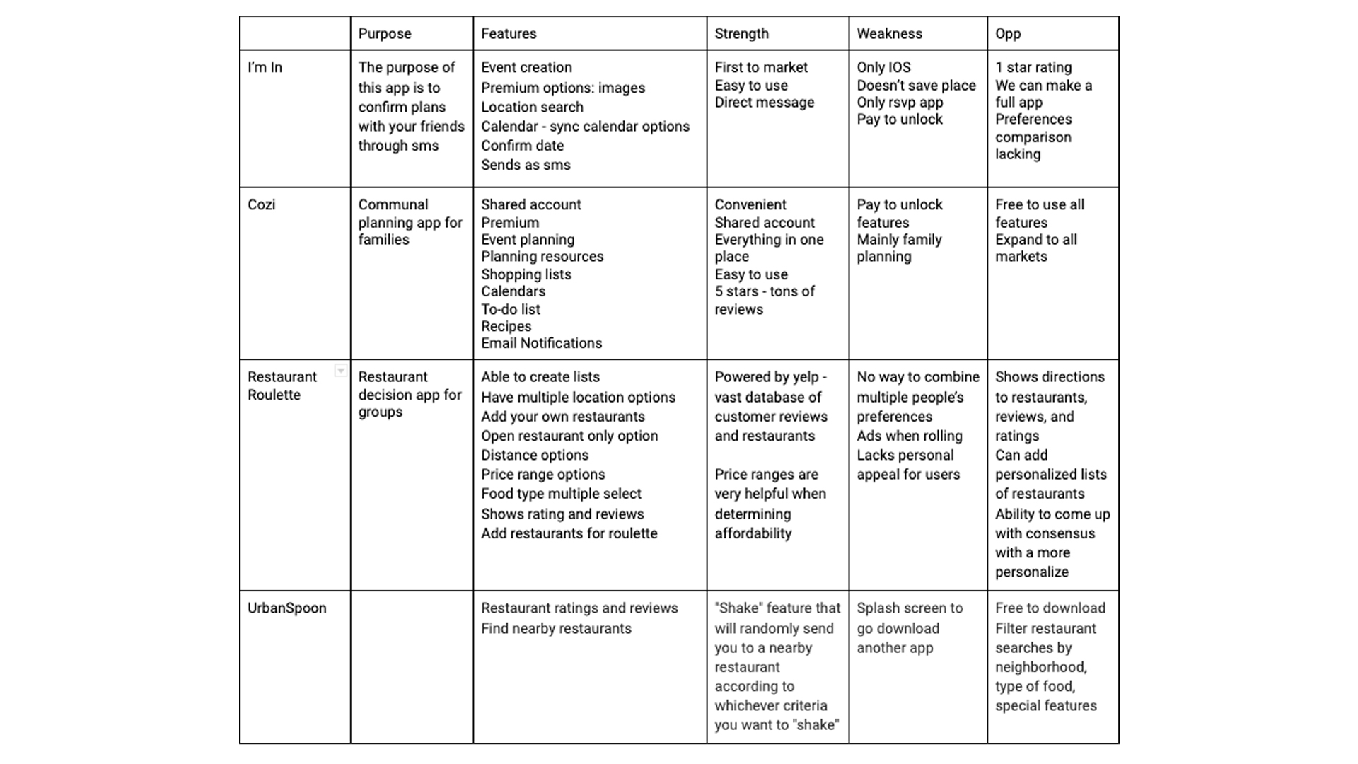
We started the definition phase by conducting a competitor analysis.
Our main take away from our competitor analysis was that there are very few true competitors that meet the need of group consensus. The closest competitor that we found was 'Restaurant Roulette' and this app lacked a communal aspect to it. All other competitors were indirect and only met a portion of the needs that our target audience expressed to us during our user research phase.
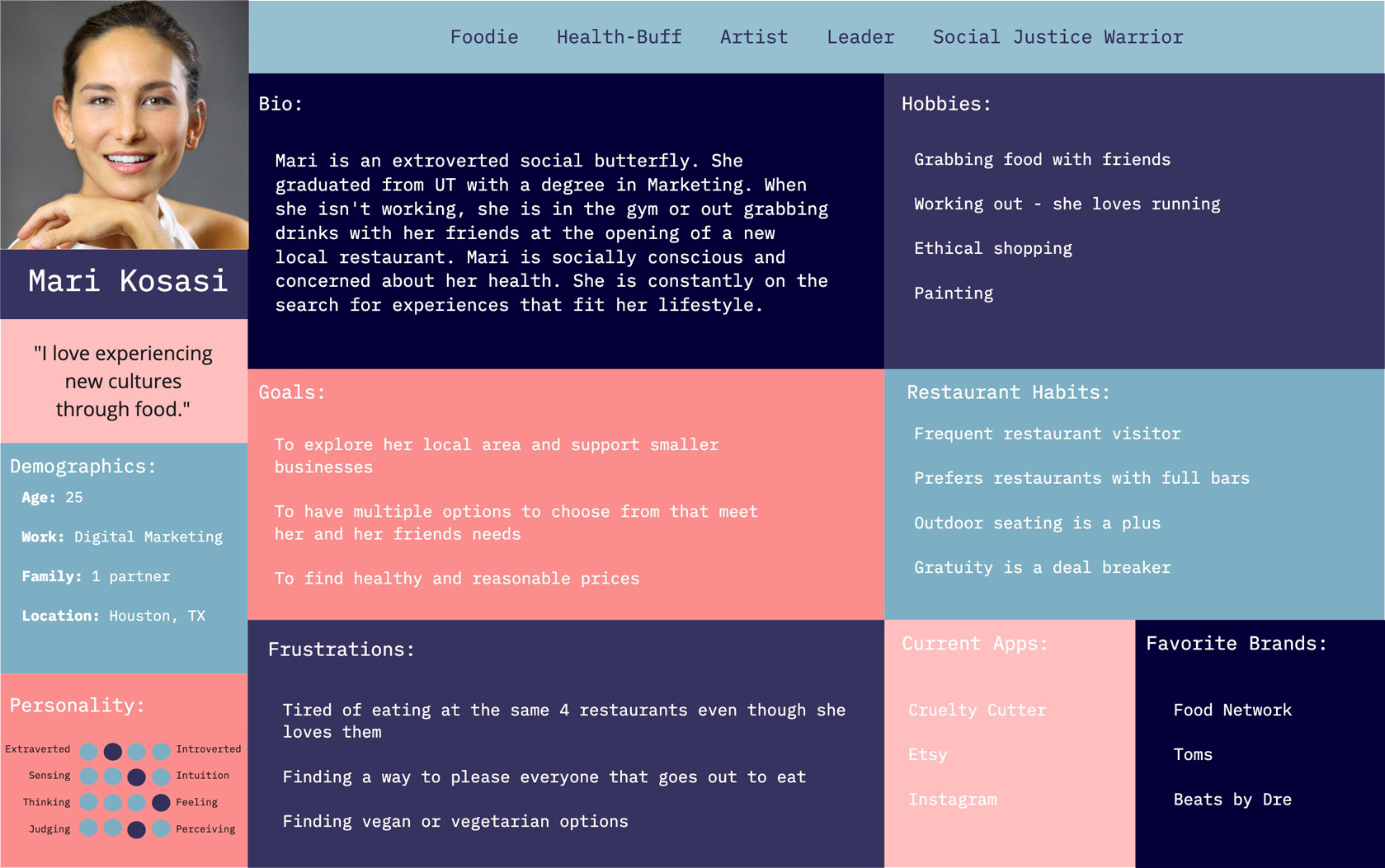
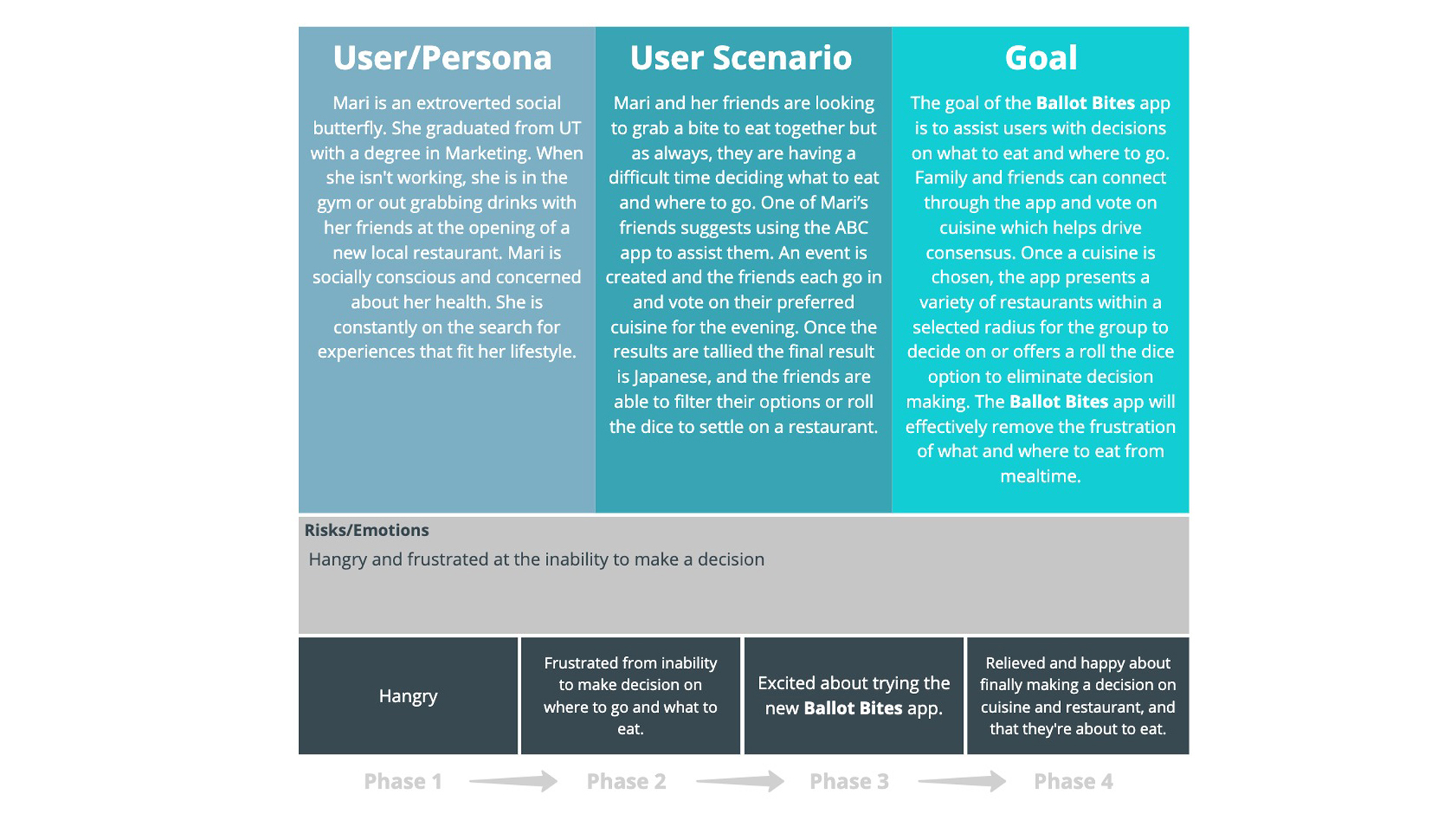
Using the research that was conducted and the user persona that was created, we developed a typical scenario of a potential user. We identified the user's goal, their risks/emotions and the different phases they go through.
We then created a storyboard and journey map based on the user scenario.
We began the prototyping phase by determining a typical user flow of the app. We iterated our user flow a few times, starting with a simple, more linear process. Our final user flow was most complex and showed a more accurate representation of how a typical user may interact with the app.
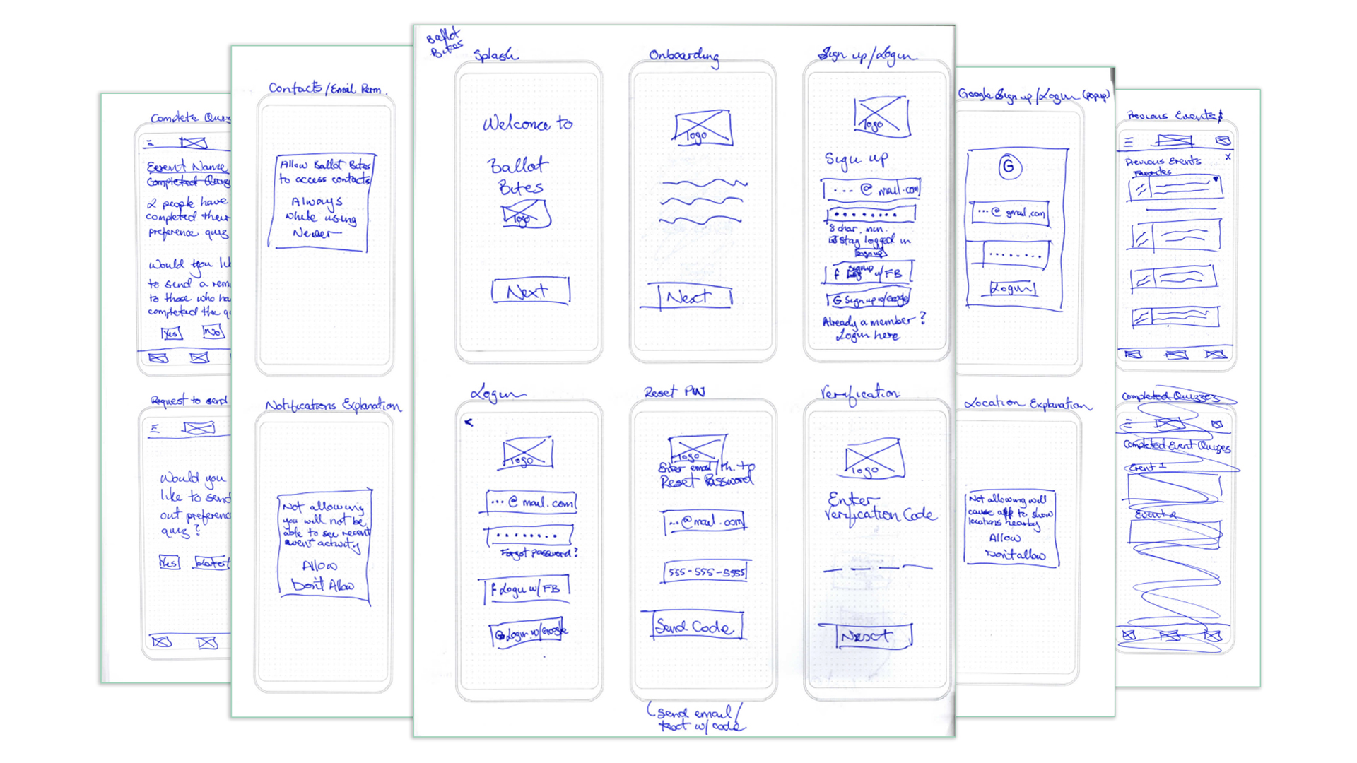
After finalizing the user flow, we move into sketching for a basic look for the app. We wanted to make sure that the app was easy to use and decided to move forward with a clean, simple layout for each screen of the app.
We then used the sketches to create wireframes. We used these wireframes to create the low-fidelity prototype for the app.
Once I completed the wireframes and low-fidelity prototype, I moved forward and created a style guide to make sure that all design elements remained consistent throughout the application.
Once I completed the wireframes and low-fidelity prototype, I moved forward and created a style guide to make sure that all design elements remained consistent throughout the application. I started with sketches to get a general idea of what the interface would look like. The biggest challenge I encountered was finding a way to incorporate all of the features into one app that was easy to navigate while being diverse enough to offer personalization and options.
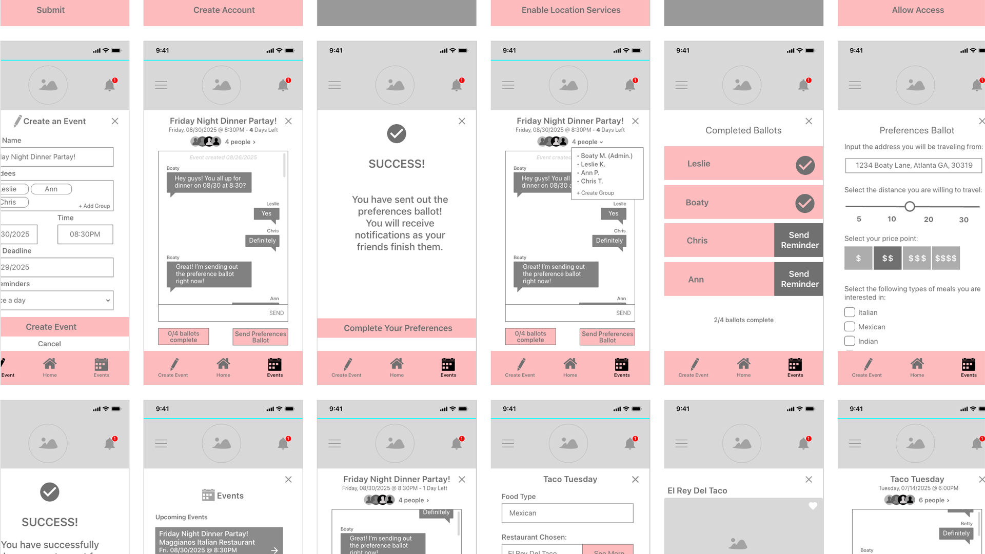
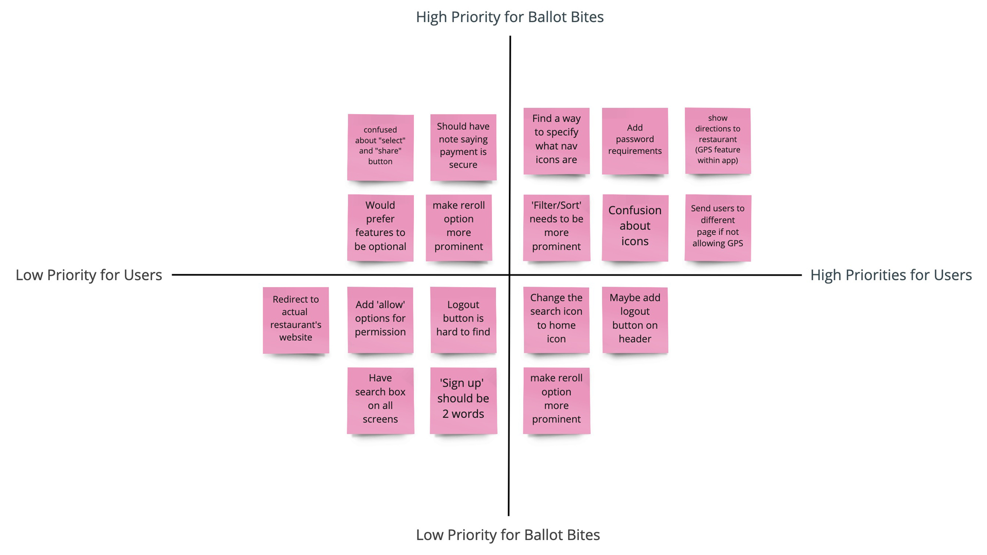
We conducted user testing with the low-fidelity prototype to see what users liked and disliked. We took that feedback and prioritized it.
Throughout the process of creating our app, our team learned the following:
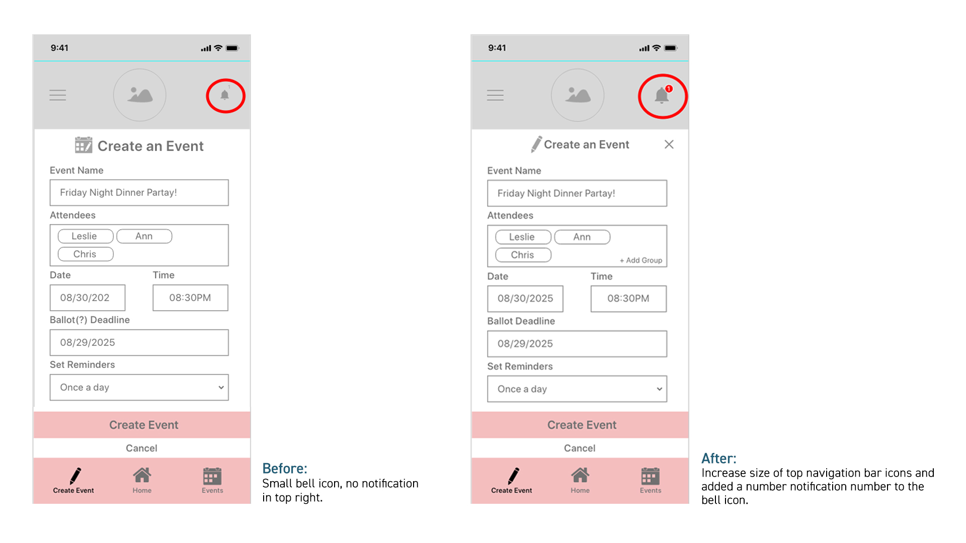
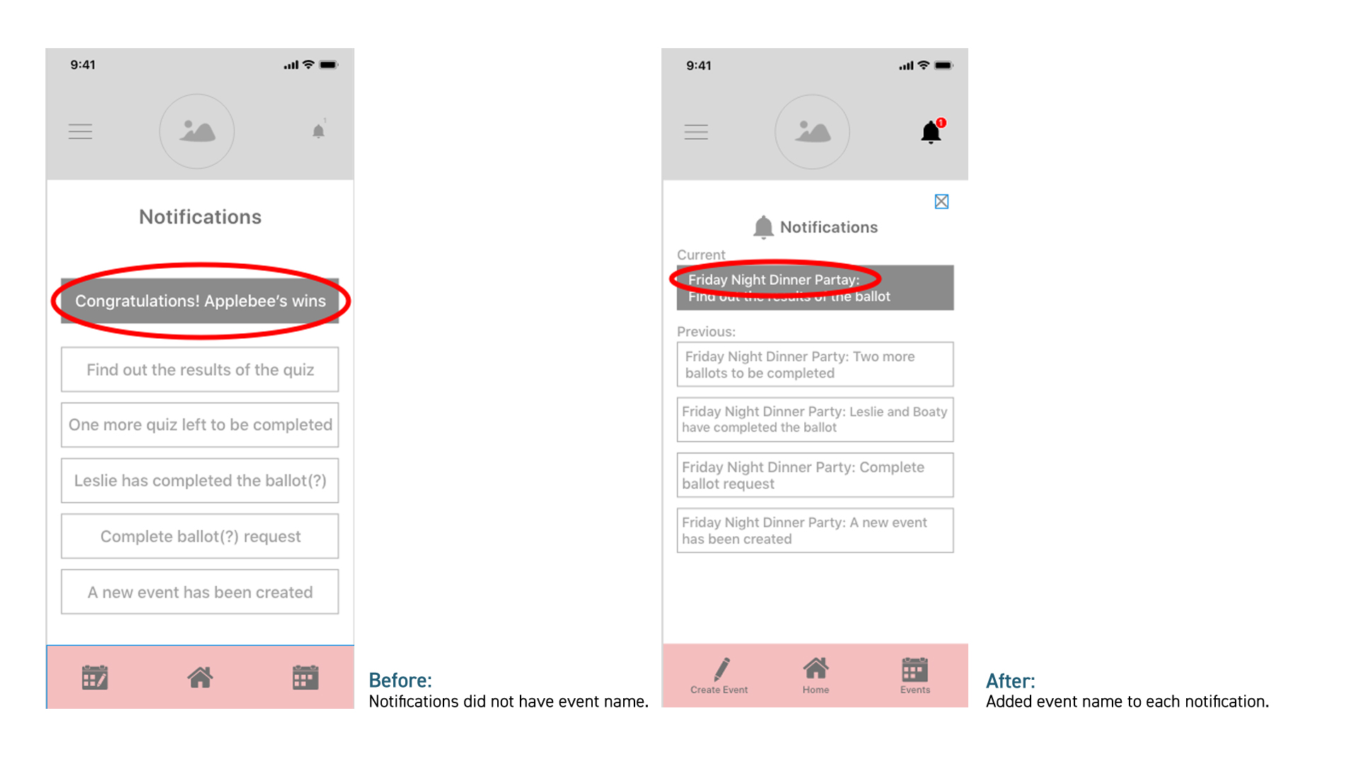
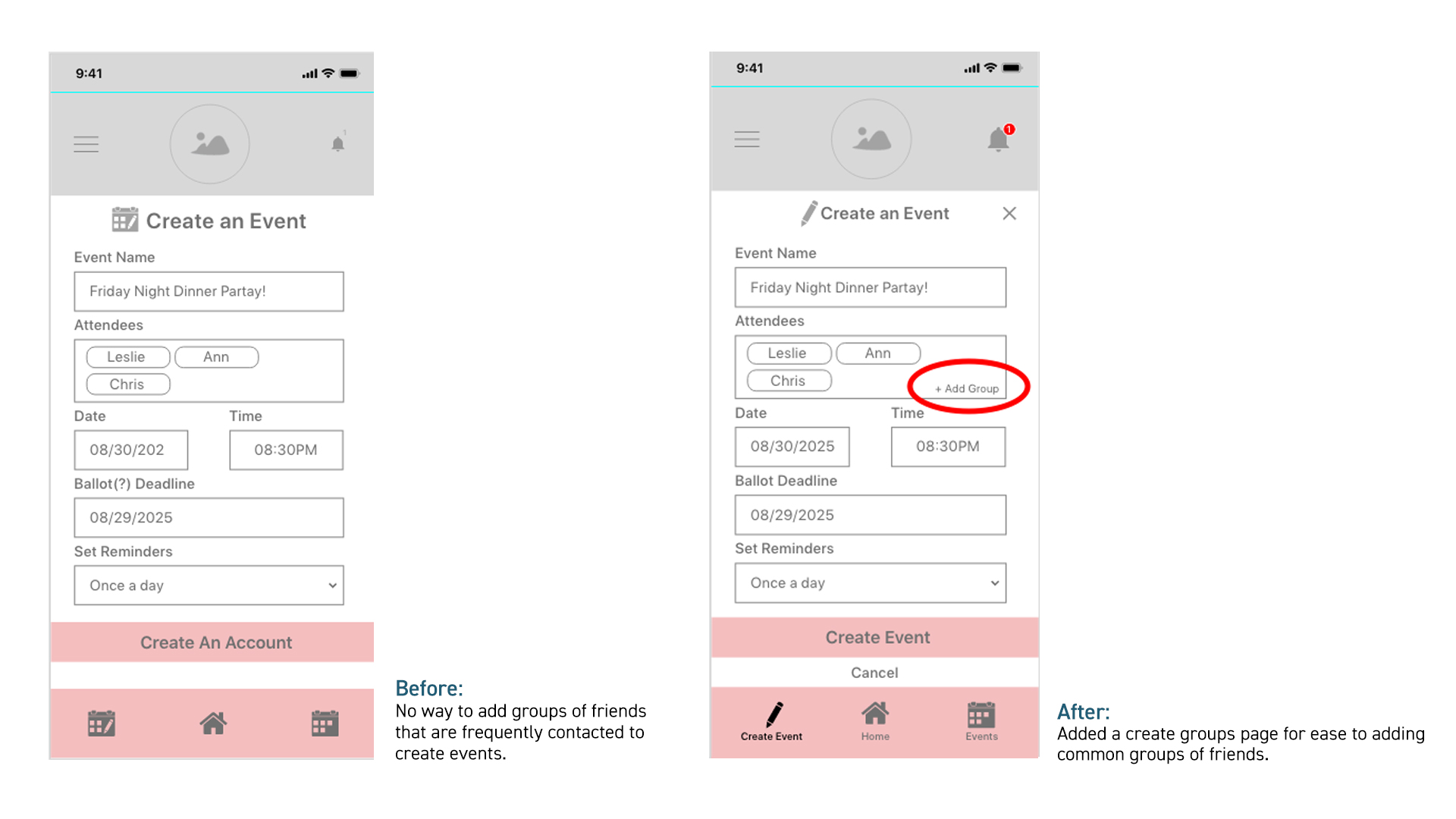
The other key assumption we made is that once we had built our app, the first iteration of it would be seamless. This was proven wrong with our guerilla user testing. Our users gave us insightful feedback such as increasing the size of the icons, removing excessive automation, adding a create groups feature, and more.
Going into this project we had the general idea that consumers struggle the most with finding new restaurants. After intensive user research we learned that our user base actually has the most frustration determining where and what to eat when they need to take in consideration an entire group's preferences. This information shaped the solution we wanted to provide for our target consumers.
The following would be included in future iterations of our app:
