
Group Project | Responsive Web Design | September - October 2020


To choose a local non-profit organization, execute the user experience/user interface design process and create a high-fidelity responsive web design solution.
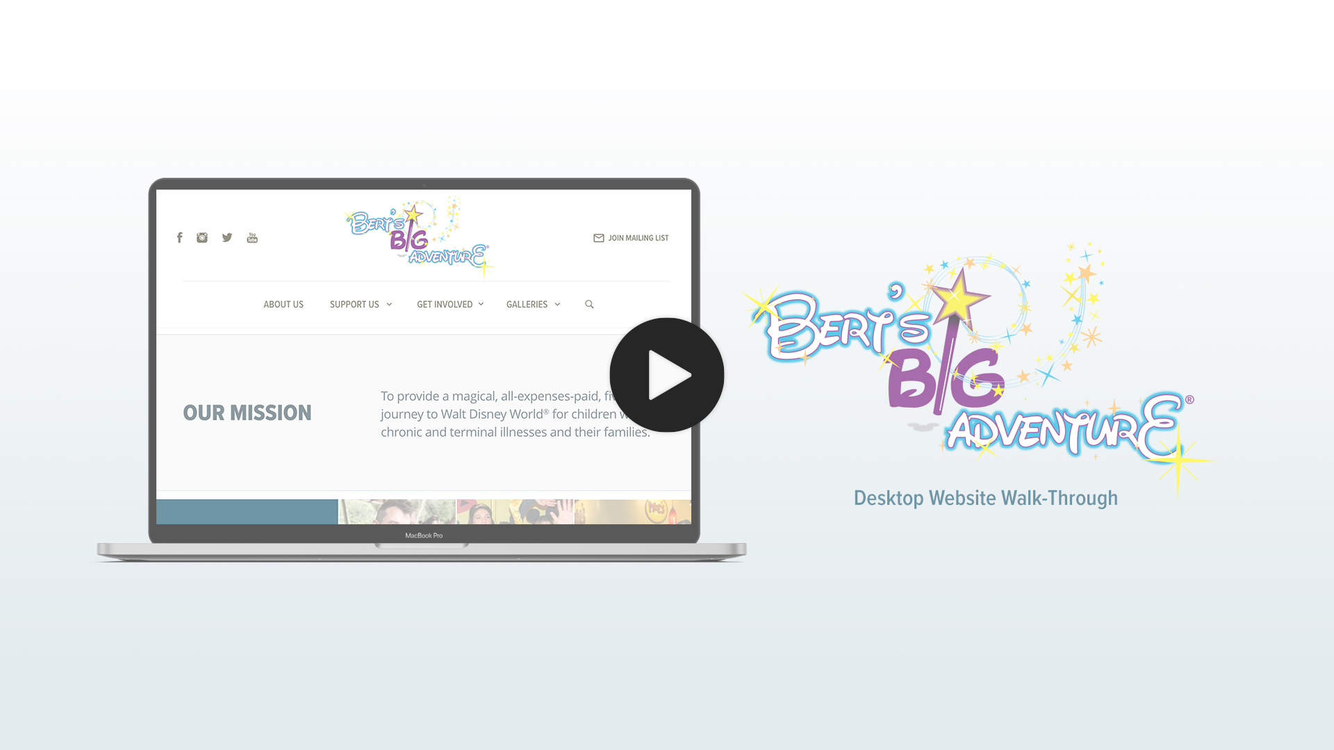
Our team chose Bert's Big Adventure, located in Atlanta, GA, for this website redesign. The website is a challenge to navigate, contains duplicate information in many places, and does not effectively use the space available.
Click here to view the current 'Bert's Big Adventure' website.
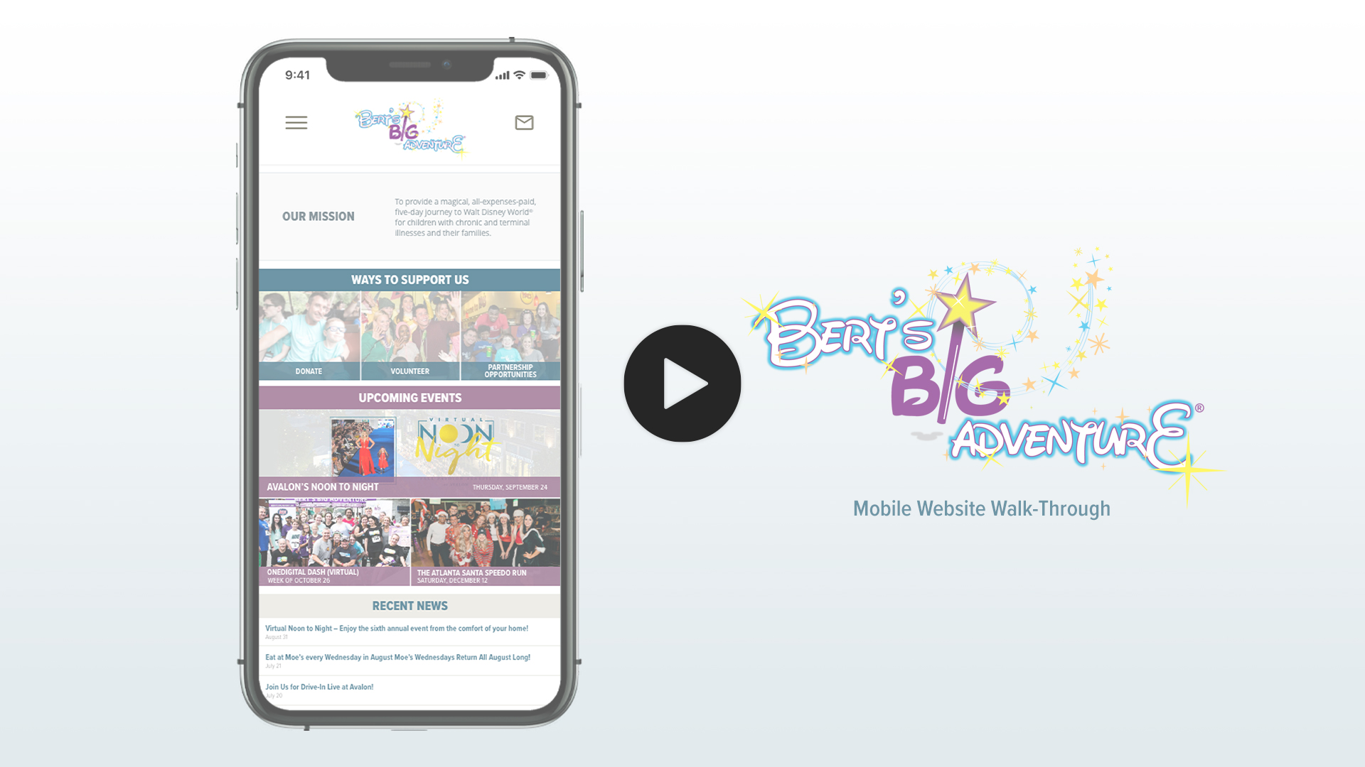
We redesigned the website with a more dynamic layout, and simpler navigation to draw a user's attention to the more important aspects of the website. Thoughtful color theory and a more cohesive design also assisted with ease of navigating through the many components of the website.
Mayur Diar & Asha Kumar
User Research, Ideation & Brainstorming, Wireframing, Prototyping, Interaction Design, Visual Design
Adobe XD, Illustrator, Photoshop; Miro; G-Suite; Trello
We began the research process by conducting a heuristic evaluation of the website. This helped determine some of the challenges that we wanted to address in our redesign.
We then focused our efforts on conducting user interviews to determine the painpoints and frustrations that users had, when interacting with the current website. Utilizing this feedback we developed an affinity diagram to categorize similar responses.
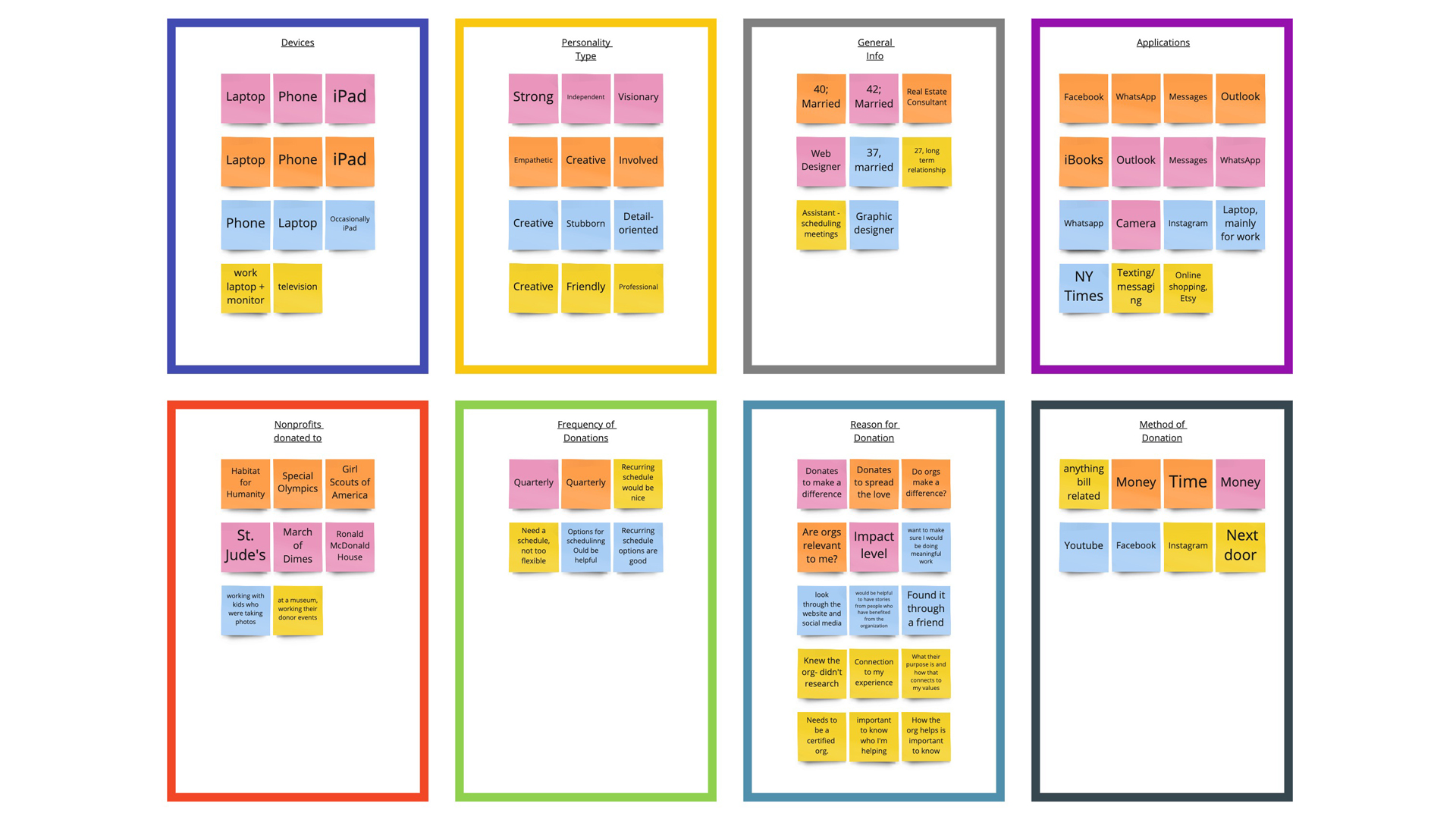
Once we had our user research completed, we used the information gathered to develop the following insights, problem statements, and scenarios.
To determine the best organization for the navigation system, we conducted card sorting exercises. We created cards for all of the links in the current navigation on the website, then had our test users sort through the card to determine what the new navigation should look like. Their feedback helped us to reduce duplicate pages and to reorganize the navigation to be simpler.
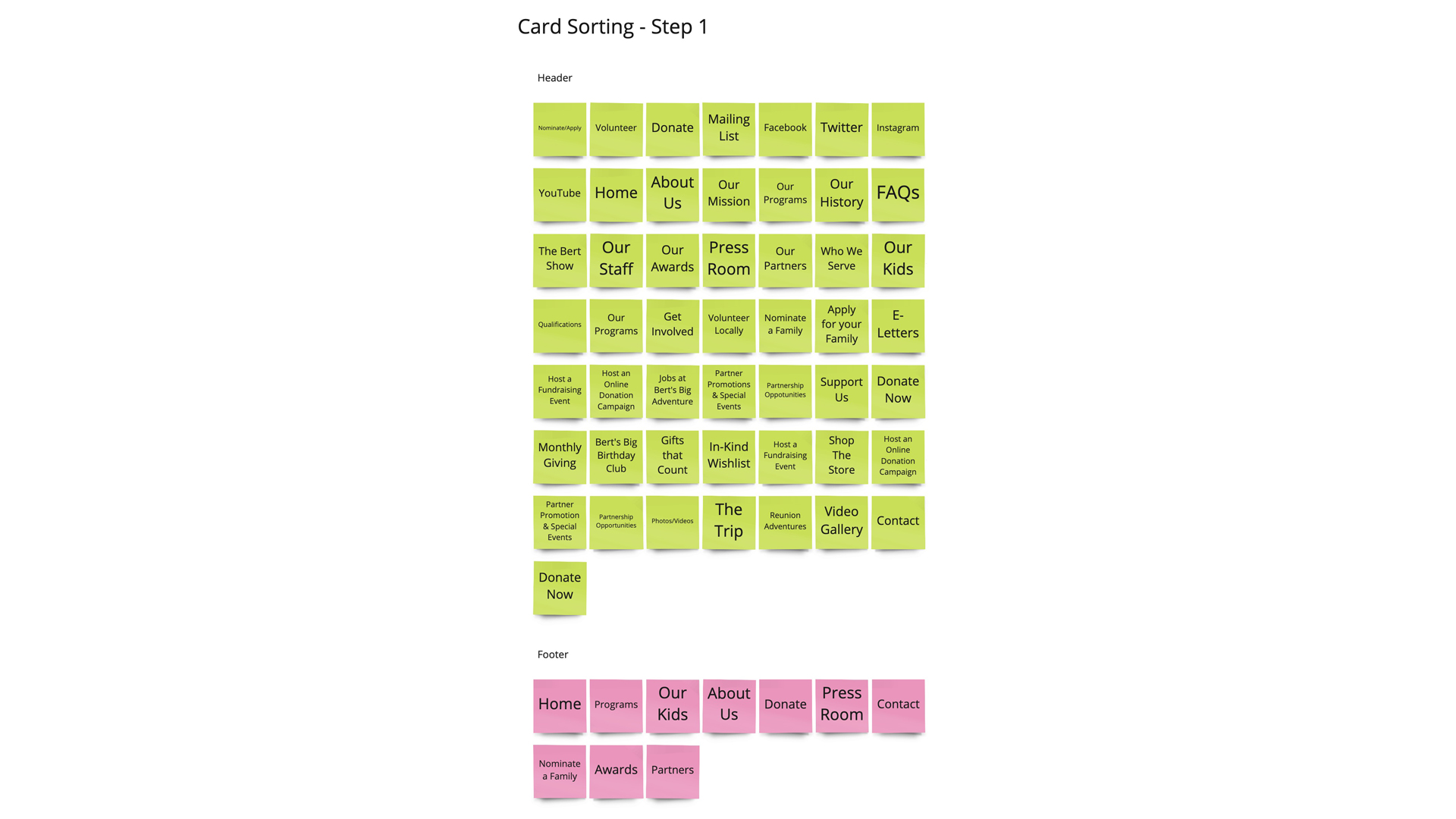
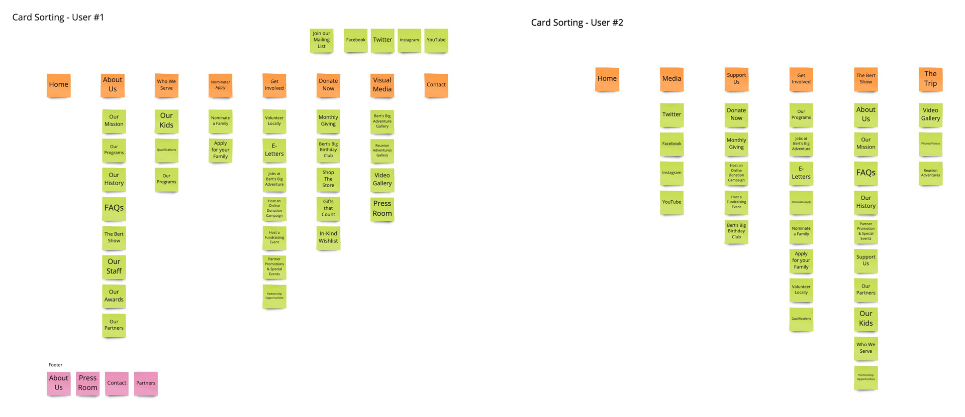
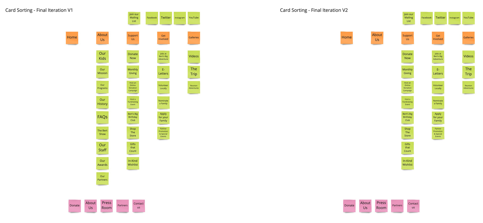
We took the sorted cards from each users, and used to determine the final organization of the site. After we completed the first version, we realized that we could make the navigation even simpler, so we made an iteration.
Using the updated version, we created a sitemap for the new navigation system.
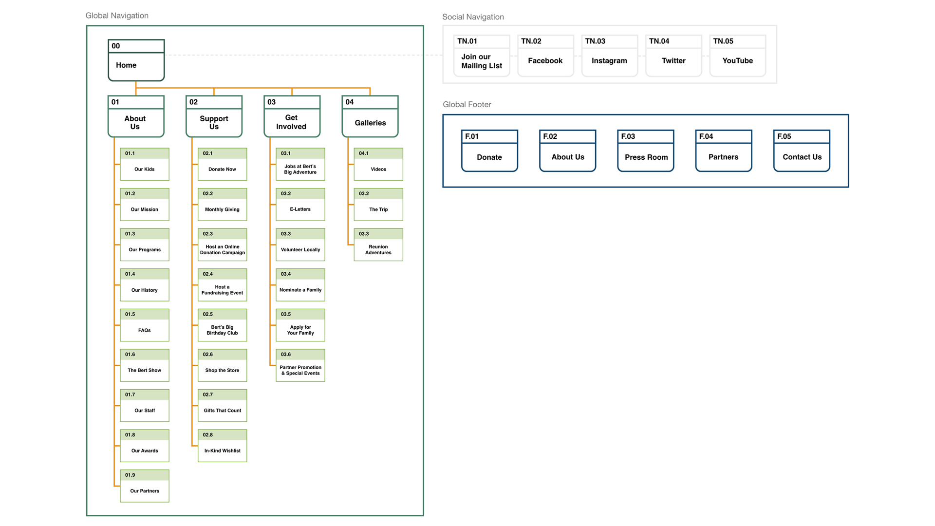
We started building our wireframes, that were used to build the low-fidelity prototypes, beginning with the Desktop version. The main purpose of our design was to keep everything clean and consistent, and we prioritized key information to ensure it was front and center.
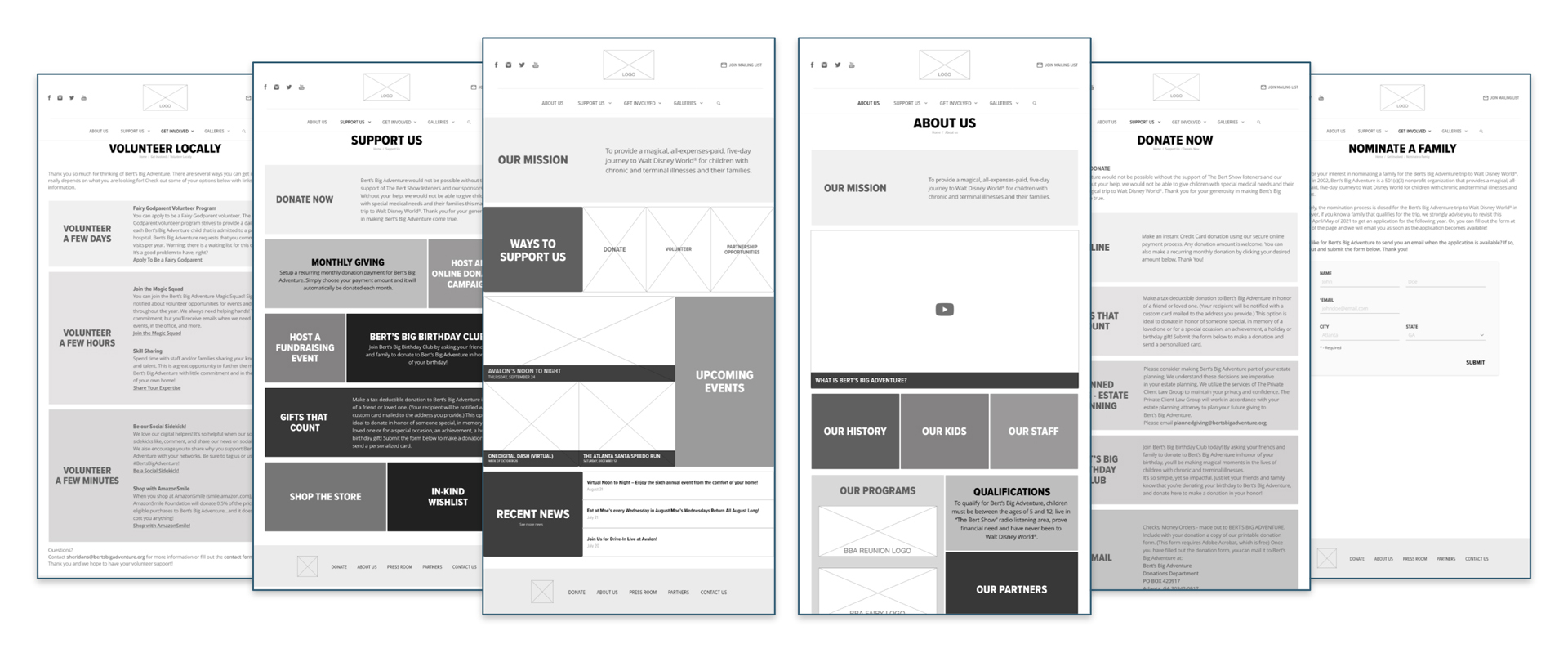
We transitioned into the responsive mobile wireframes. We focused on keeping the mobile design consistent with the desktop version to build familiarity between the platforms.
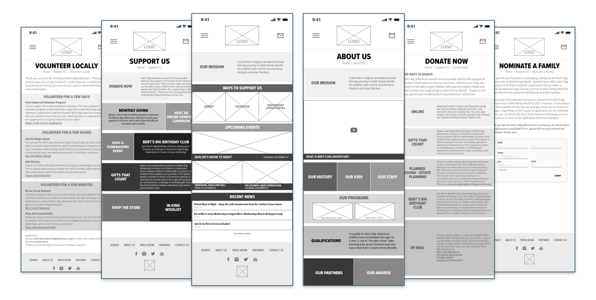
We had users work through 5 different scenarios to test all of the aspects of the website that are important to the redesign:
Overall, the results from our testing were fairly positive, we only had a few pieces of feedback, including adding rollover states to links on the page, which we implemented in the high-fidelity prototype.
The redesigned version is much cleaner and easier to navigate. The pages flow well and have a cohesive look and feel. Our team paid close attention to color theory, imagery, and layout to grab a users attention while still maintaining important content.
As we look towards next steps for this project, we think a few new features could be included in future iterations:
