
Individual Project | Mobile App Design | June - July 2020

To build a mobile app to help the modern traveler plan their next trip. For my target audience, I chose to focus on RV and camping enthusiasts.
The current RV/Camping travel app market is untapped. Leading to an inability for outdoor enthusiasts to proactively locate and book RV and camping sites in a streamlined way through one application.
‘On The Road Again’ is an all-in-one travel app that assists outdoor enthusiasts in finding and booking lodging and experiences to fit their needs. We stand out because our application includes all types of properties, unique filtering capabilities, and relevant reviews that aid in making the best decision. ‘On The Road Again - We help you Navigate your Next Adventure!’
User Research, Ideation & Brainstorming, Wireframing, Prototyping, Interaction Design, Visual Design
Adobe XD, Illustrator, Photoshop; Miro; Figma; FlowMapp; G-Suite; Otter
We have great friends who snowbird their way through the United States each winter. They complain often about needing to use multiple applications to find various types of lodgings during their trips. I was inspired by their struggle and felt the need to create something that would help them on their adventures.
I began my research by identifying the typical user for an RV/Camping travel app, including the user’s goals, needs, pain points and frustrations. I then created and conducted interviews and surveys to gain user insights from the target audience.
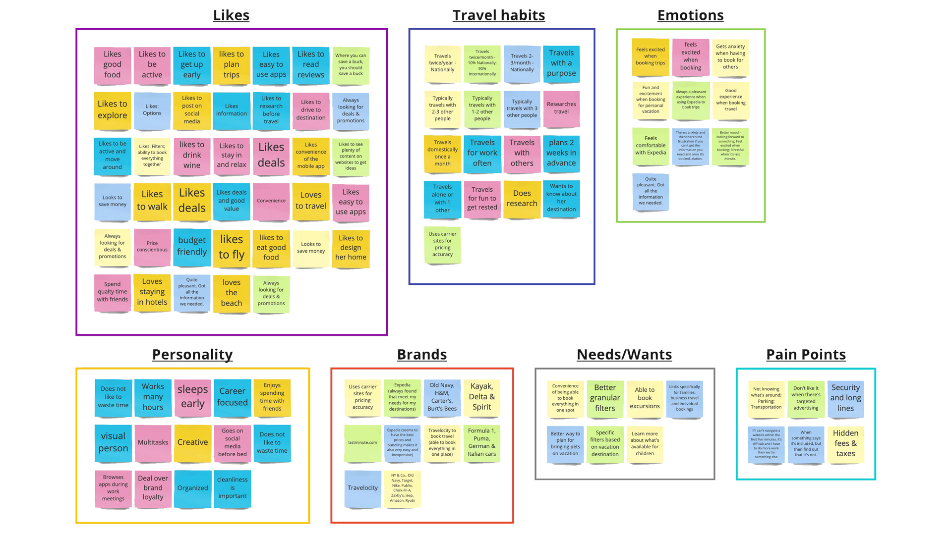
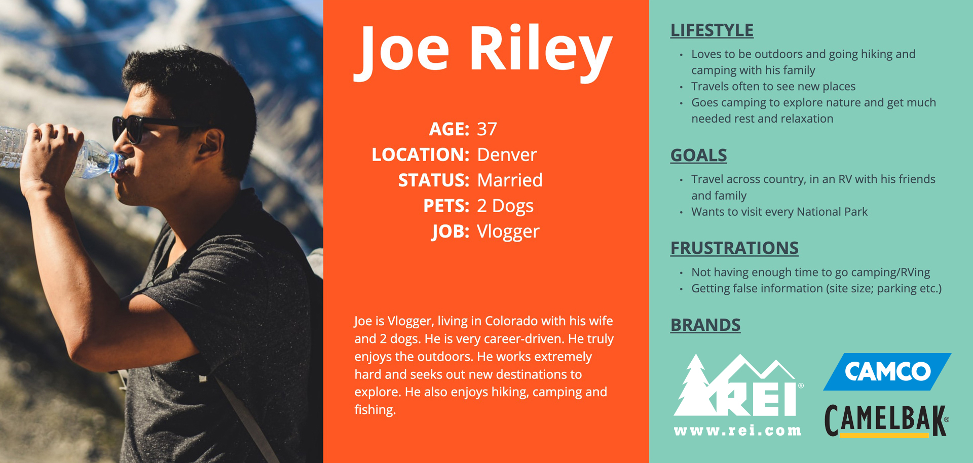
Utilizing user feedback I developed an affinity diagram to categorize similar responses and created an empathy map to establish a typical user persona.
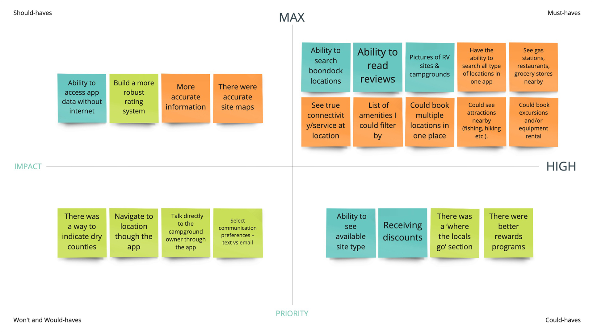
After completing the research I compiled the feedback within a feature prioritization matrix to build hierarchy and determine feasibility.
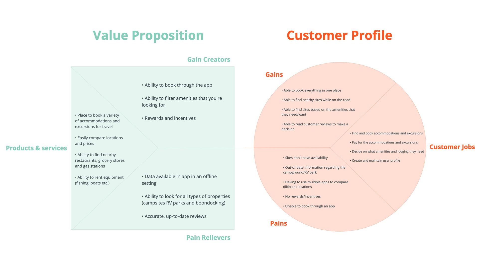
Next I developed a value proposition to match the users needs with the app, which helped me to create a typical user scenario. Utilizing the user scenario, I developed a storyboard and journey map to complete the overall view of the user.
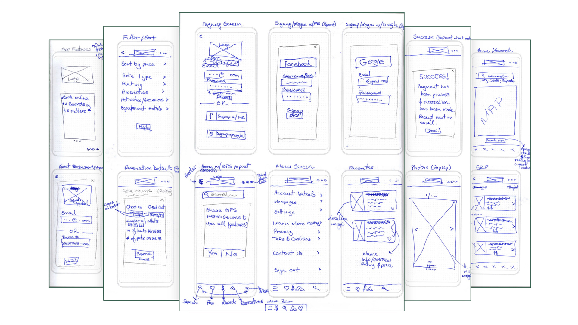
I started with sketches to get a general idea of what the interface would look like. The biggest challenge I encountered was finding a way to incorporate all of the features into one app that was easy to navigate while being diverse enough to offer personalization and options.
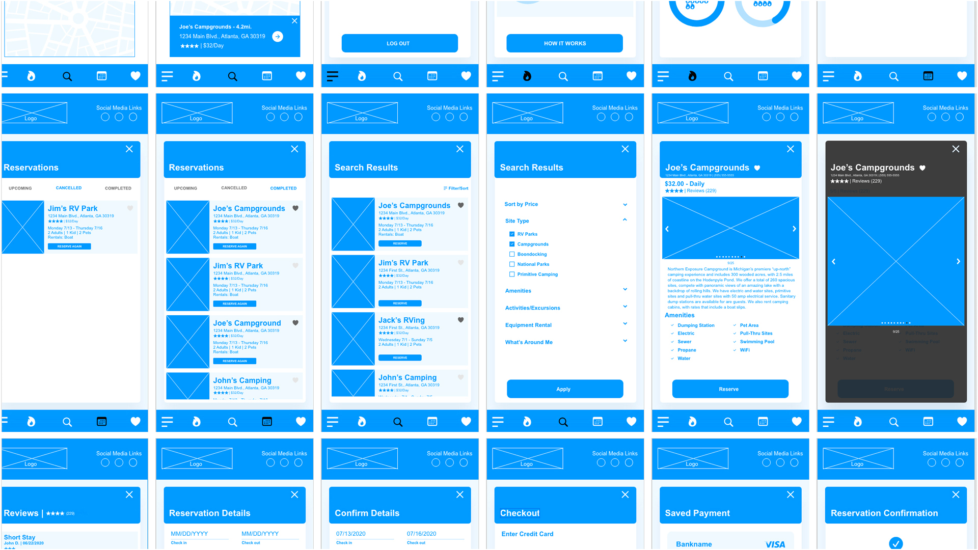
Using the sketches, I moved into creating wireframes, which were used to create a low-fidelity prototype.
Once I completed the wireframes and low-fidelity prototype, I moved forward and created a style guide to make sure that all design elements remained consistent throughout the application.
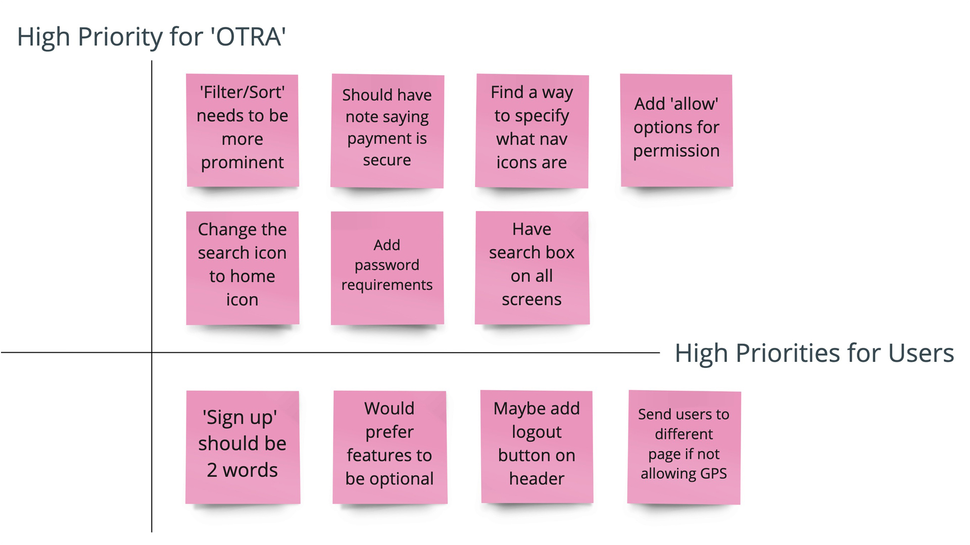
I began user testing to gain feedback on the low-fidelity prototype.
My key objectives were to gain insight on whether a user:
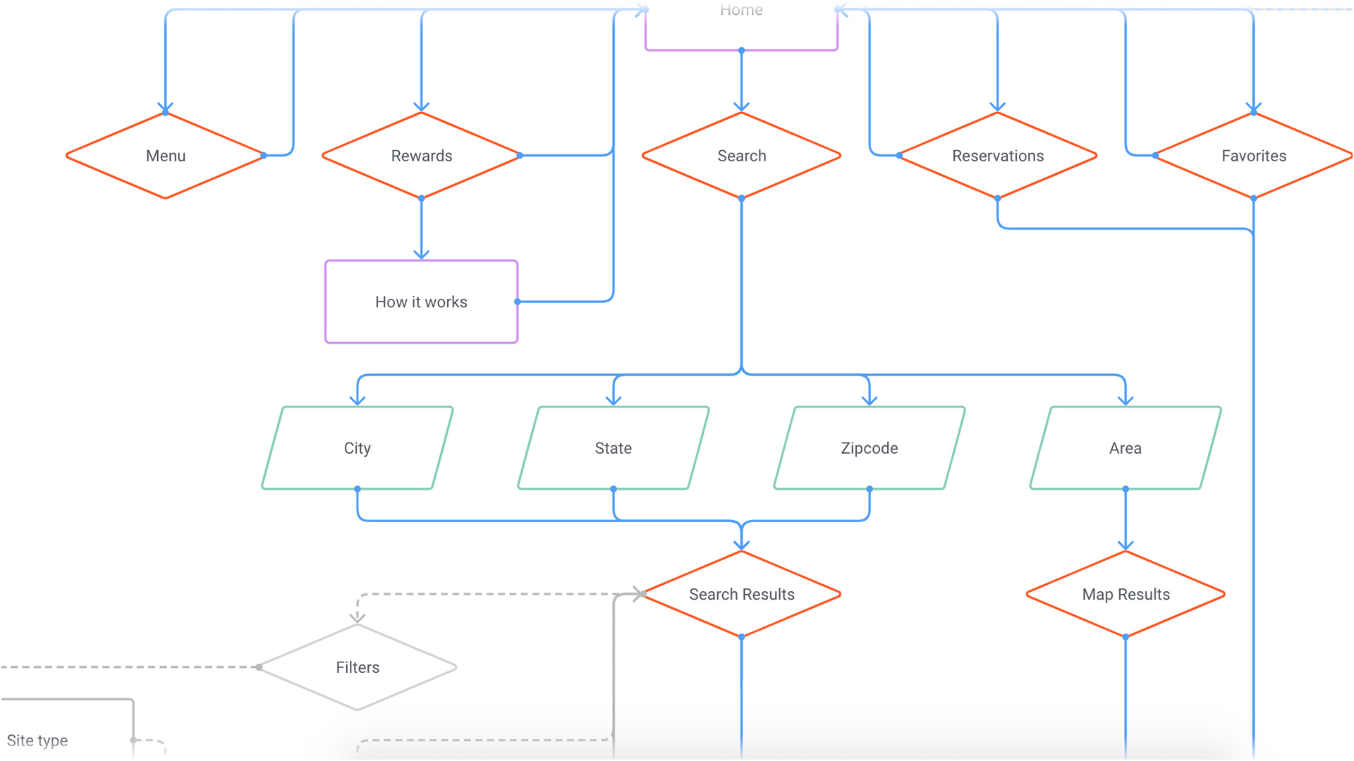
Overall, the feedback that was received were easy fixes that were implemented in the high-fidelity mockup. Feedback notes were captured in the user testing analysis matrix and iterations were made to the user flow.
‘On the Road Again’ is a well thought out and ambitious application that has the potential to be extremely helpful for RV/camping enthusiasts.
I learned early on how important it is to fully understand the user and their needs in order to build a solution that makes an impact. Also, in order to create a successful project, you may need to take a few steps back. This process is not linear.
